Candlestick, Heiken Ashi, and Renko, what do they have in common? These charts are Japanese inventions, the former two of which are credited to Munehisa Homma (1724-1803).

Homma was a rice merchant who traded futures markets for rice in Osaka, Japan. He is also often attributed to having developed many popular price action patterns prevalent with Japanese candlesticks.
At its core, the original Japanese candlesticks remain the most diverse of all charts with what they represent about the market.
Considering that these are also visually appealing, it’s easy to see why they are prevalent. On the other hand, traders laud the Heiken Ashi and Renko for their immense noise-filtering capabilities that you don’t find with traditional candlesticks.
So, this begs the question, which is the best chart to use in forex? Let’s find out.
What is a candlestick chart?
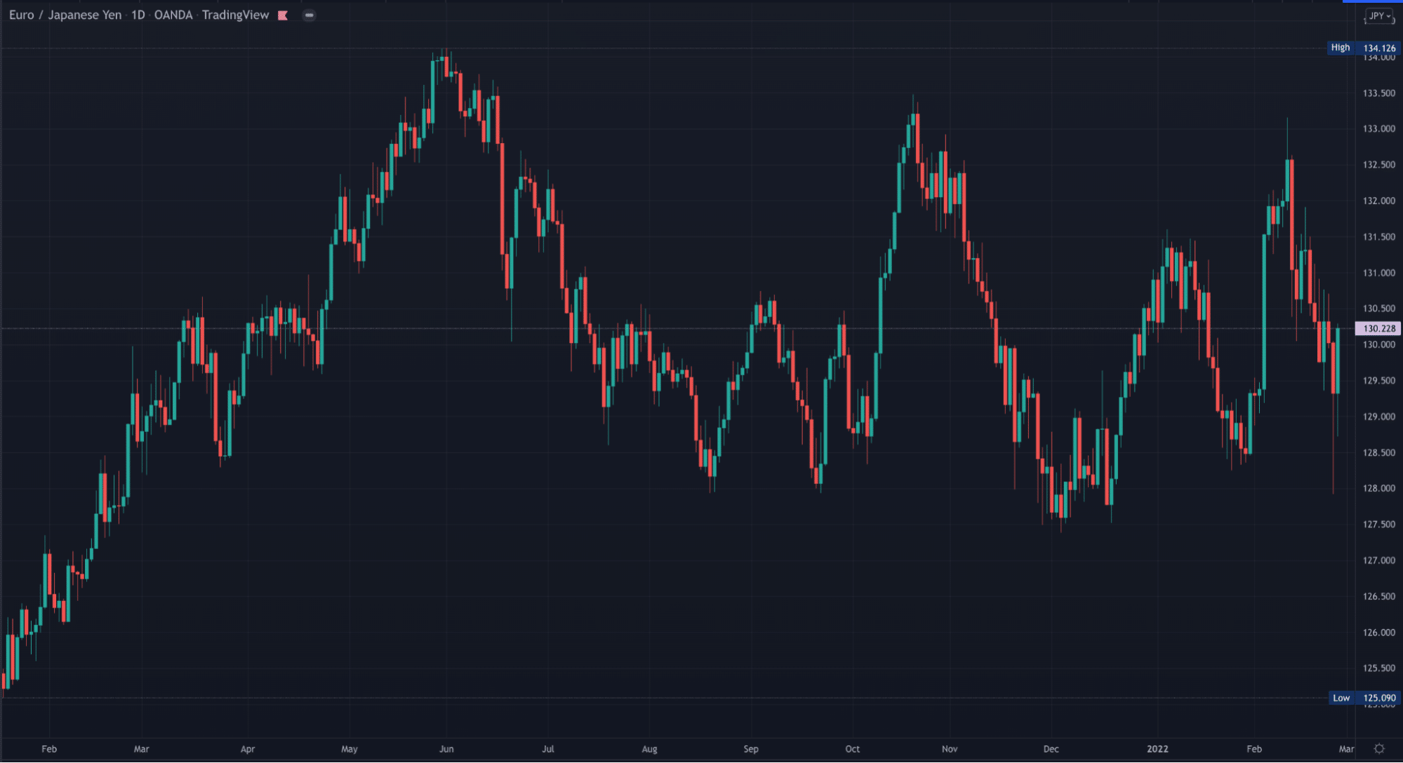
Japanese candlesticks are the most popular chart used in virtually all financial markets, ranging from stocks and indices to cryptocurrencies and commodities. As the word suggests, they mimic actual candles, typically consisting of a body and a wick on either side.

You can always read the open, close, high, and low of a particular period on any time frame. Japanese candlesticks don’t use any specific formula as they represent price naturally.
Since they show all four aspects of price, these charts are incredibly versatile, leading to unique candle formations or patterns.
This has led to somewhat of a ‘price action movement’ where legions of traders are well-versed in specific patterns like hammers, pin-bars, spinning tops, and many more.
Pros
- As briefly mentioned, Japanese candlesticks are the most dynamic as each candle provides more nuanced clues about what occurred in a particular session.
- Due to this versatility, these candlesticks are aesthetic to the eye because of the unique variations you find when reading the markets.
- Another point worth mentioning here is that MT4 and MT5 (two of the most commonly used forex trading platforms) offer Japanese candlesticks but neither Heiken Ashi nor Renko.
Therefore, you need to access other platforms to use the latter two charts.
Cons
The main downside with Japanese candlesticks is they show too much information, which analysts refer to as ‘noise.’ Therefore, it can be more challenging to visualize trends.
What is Heiken Ashi?
Heiken Ashi (meaning ‘average bar’ in Japanese) is also a candlestick chart reflecting a particular session’s open, close, high, and low. However, this chart uses a special formula to present this data.
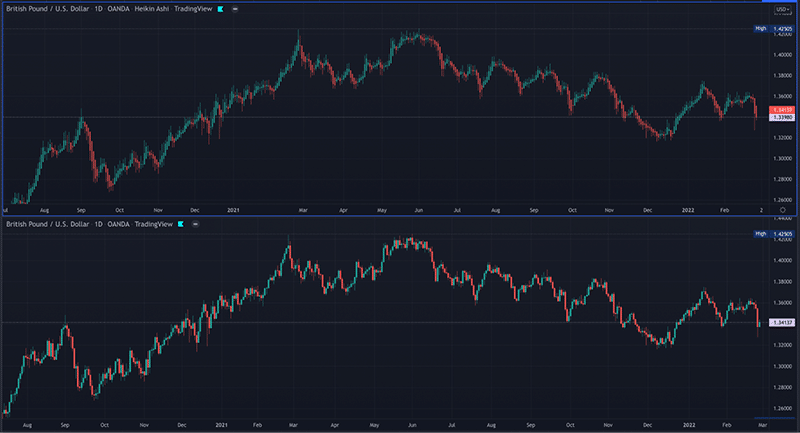
The beauty of Heiken Ashi is it tracks an average range of price instead of showing every little movement like traditional candlesticks. This change results in a less noisy chart allowing traders to best visualize trends and show significant pauses in them.
Below is an image of the Heiken Ashi and candlesticks to show how smoother-looking the former is.

Pros
- Heiken Ashi strikes the perfect balance between not being too undetailed (as with Renko charts) and not being too noisy (as with ordinary candlesticks)
- Due to this filtering quality, Heiken Ashi is the best chart to use to identify a strong-trending market with very few ‘whipsaws.’
If the price rises, the bar will remain green; if the price is falling, the bar will keep showing red. In many cases, the regular candlestick chart will alternate between the two and often present a range of confusing, insignificant structures.
On the other hand, you will get longer stretches of green and red bars with Heiken Ashi, helping traders to stay longer in trends and exit at a much later stage.
Cons
- The main disadvantage with Heiken Ashi is it leaves out essential, nuanced information about price (but not as much as Renko bars).
- Something else to keep in mind is Heiken Ashi is not available on any of the MetaTrader platforms natively (although various indicators have been created for this chart).
What is a Renko chart?
A Renko chart takes noise-filtering even further as it only considers directional movement instead of time, unlike the former two that factor in both elements. Experts believe ‘Renko’ comes from the Japanese word ‘renga,’ translating to ‘bricks.’
These bricks are always positioned at a 45-degree angle of the same size. Interestingly, there is no time interval in the formation of a new block.
Therefore, depending on market behavior, one block can take a few hours to form while another may form after a day. It’s this quality that heavily decreases the signal-to-noise ratio.
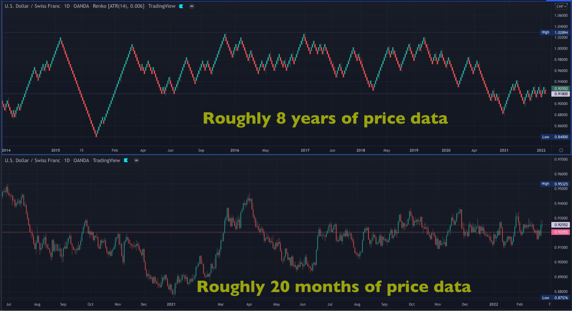
A Renko chart can squeeze in months of data in just a series of blocks. Note the differences between Renko and candlesticks. Renko presents about eight years of price information in the image below, while the latter only shows roughly 20 months of the same pair when viewed side by side.

They filter out noise even more than Heiken Ashi, showing you the ‘barebones’ of price action and the key support and resistance. Moreover, a color change with the blocks is more significant when identifying trends.
However, Renko is too simplistic and less nuanced, leaving out many nitty gritties that skilled analysts like to observe. Also, like the Heiken Ashi, this chart type is not available natively on the MetaTrader platforms.
Curtain thoughts: which is the best chart to use in forex?
Overall, most forex traders still prefer to use Japanese candlesticks for numerous reasons. These are beginner-friendly, visually aesthetic, more accessible in software availability, and detailed. Furthermore, you can see intricate patterns providing subtle information about where a market is likely to go next.
Generally, it’s common for many to use candlesticks as their primary chart and perhaps switch to Heiken Ashi and Renko for secondary analysis once in a live position.
These can offer them information on trend progression and clues on how long they should remain in a trend because they are more streamlined than candlesticks. These charts are best used when you are more experienced with charting, particularly for swing or long-term trading.
Therefore, although candlesticks are the most universally used chart, traders are not limited to sticking to just this alone and can switch between a range of these where necessary.