You have probably seen that most traders use Japanese candlesticks for their analysis because it is the most common representation of price. But, did you know there are other ways of looking at it equally or even more interesting?
Throughout history, people have created different ways of looking at the price of an asset. It is essential to know different graphical representations of the price because it can often facilitate the analysis.
Among the most popular representations in technical analysis are Japanese candlesticks, Renko, Lines, and Heikin Ashi. Each of these has its characteristics that will be mentioned throughout the article.
For example, many beginner traders start with Japanese candlesticks and then migrate to lines or Heikin Ashi candlesticks because they find it easier to interpret them.
We will discuss the advantages and disadvantages of using each kind of chart. In the end, we will conclude on which one to use according to your experience and goals.
What are Japanese candles, and how to interpret them?
Japanese candles are the best known and most used graphical representation of the price by traders worldwide. The main reason for this is that these candlesticks give us clues of where the price might be headed next.
Each candle must be divided into three parts: body, wick, and color.
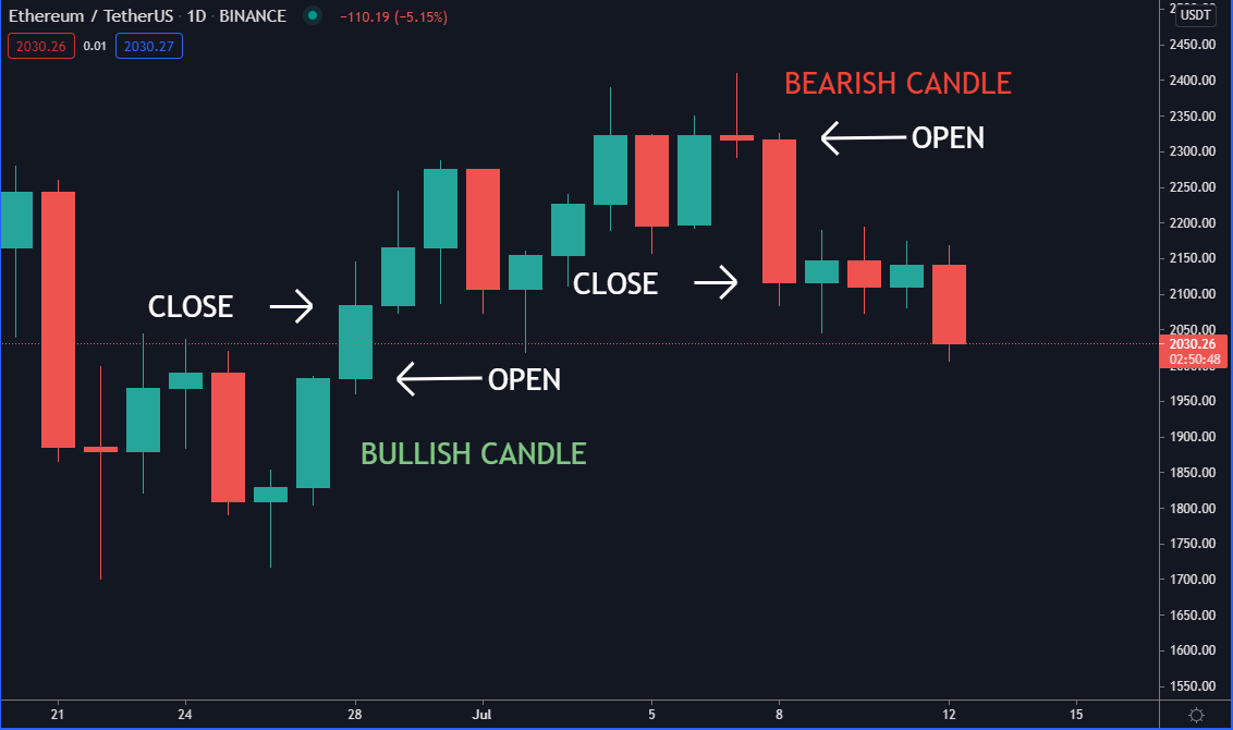
The candle’s color depends on whether it’s a bullish or bearish candle. If the closing price of the candle is higher than the opening price, the candle turns green. On the contrary, if the candle closes below its opening, the candle will be red. The wicks show the low and high that the price had while forming the candle.
We will not go into detail about the candle patterns but let’s look at an example.
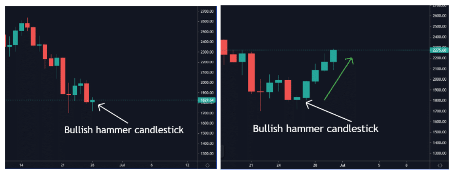
The bullish hammer candlestick is one of the most used patterns to give traders a buy signal.
The opposite of this pattern would be a bearish hammer candlestick which often occurs at the end of an uptrend.
One notable disadvantage is the difficulty of interpreting patterns in times of volatility. Candles always move along with the price; this can confuse you if you are a pattern trader. On smaller time frames, this disadvantage is noticeable in particular.
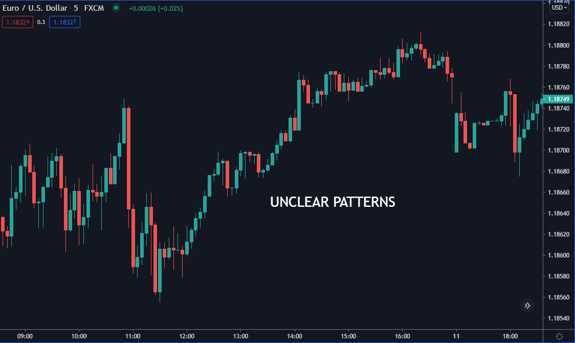
Traders may use technical indicators to confirm candlesticks patterns, thus eliminating the price noise.
What are Heikin Ashi candles, and how to read them?
Unlike Japanese candlesticks, the Heikin Ashi takes into account average prices. Therefore, visually, it is advantageous, especially to identify trends.
If we are in an uptrend, most of the candles will be green. On the other hand, if we are in a downtrend, they will be red.
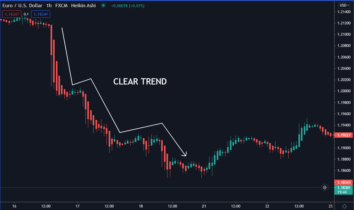
The main advantage of using the Heikin Ashi is the noticeable decrease of noise on the graph.
Noise is anything that does not allow the graph to be interpreted clearly.
Let’s see a comparative example.
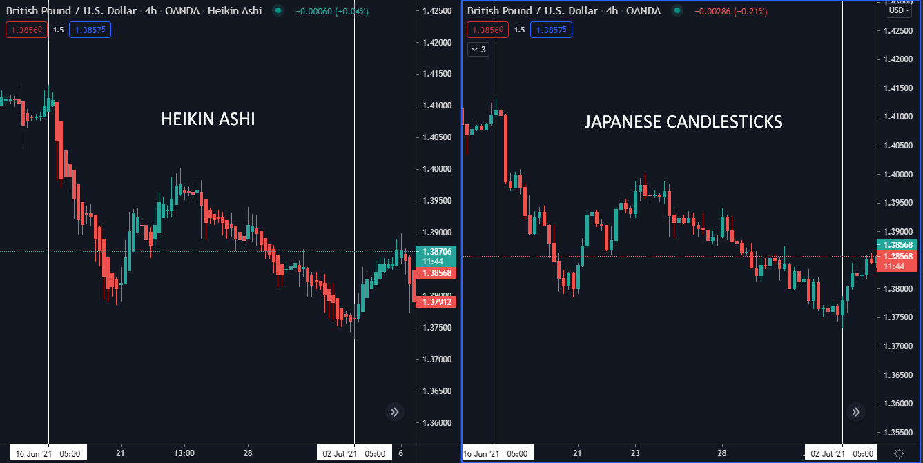
In the image above, you can see the difference between the two types of candles. Heikin Ashi makes it easier to identify the price trend.
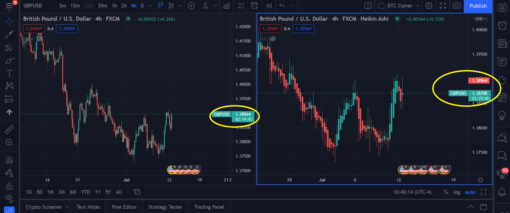
The main problem is that it does not give you the exact price in real-time because they are made up of averages. However, Japanese candlesticks do give us this updated information.
Renko candles
They are very similar to Japanese candlesticks. Still, they have the feature that they only consider the price movement and not the time.
As you can see, there is no time on the chart, which means that the candlesticks will only be drawn when the price moves. So, if it remains stable over time, we will not have new figures.
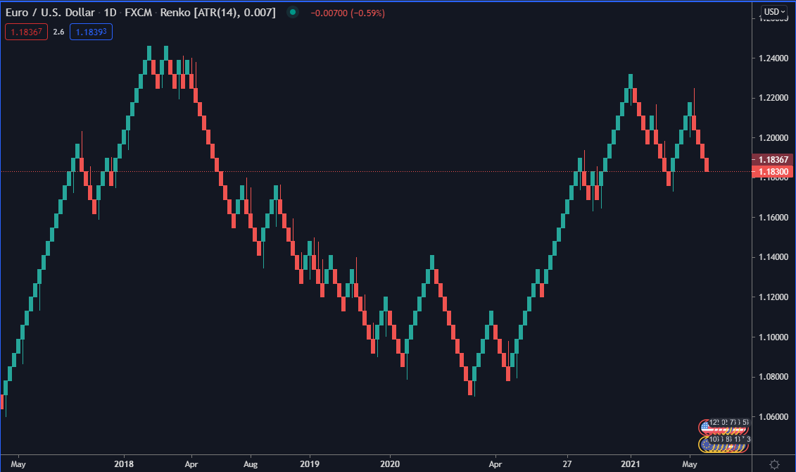
Like Heikin Ashi candlesticks, Renko will help you eliminate chart noise, identify trends, and support or resistance.
The disadvantage is that they do not work in ranges. If the price movements are small in percentage, there will be no representation of Renko candlesticks. For ranges, it is recommendable to trade with Japanese candlesticks.
Lines, best for long-term investors?
Before candlesticks were adopted by Western exchanges, using a line to view price action was the most common way to analyze a financial asset.
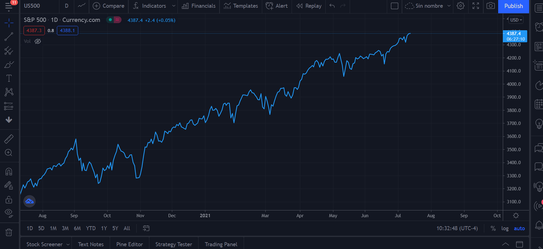
As the chart is made of closing prices, it is pretty challenging to perform technical analysis by looking at just lines. However, it is not impossible.
Unlike candlesticks, lines give us little information. They do not help in pattern recognition, which for an intraday trader is not practical.
Using lines can be beneficial for swing trading or long-term investments based primarily on fundamental analysis and not so much on technical indicators.
With lines, we can minimize the impact of emotions on trading. For example, a red candle can be decisive for a trader to close his position.
Conclusion
The different graphical representations we have seen have something in common. They help us in some way to interpret the price movement of an asset.
Suppose we refer to the most common way of looking at price. In that case, candlesticks take the crown because of the detailed information they provide.
For a new person in trading, it will be easier to get information and expert analysis on Japanese candlesticks or Heikin Ashi.
The control of emotions plays a vital role in investments. For example, red and green colored candles can affect your decision-making.
Professional traders recommend changing the color of the candles or simply using lines to avoid getting stressed by the ups and downs of the market.
Remember to study and test each kind of price chart to discover the one best fits your strategies.