Chart patterns are essential formations that help traders predict future price movements of financial assets. These patterns are used in both technical analysis and price action trading strategies. They are also used in day trading, swing trading, and long-term trading. Further, the patterns can be used in trading all financial assets, including currencies, stocks, commodities, and exchange-traded funds. In this report, we will look at the five most common chart patterns in the market.
Triangle patterns
A triangle pattern happens when there is a battle between buyers (bulls) and sellers (bears) of a financial asset. It happens mostly at the middle of an upward or downward trend. For example, a currency pair in an upward trend can find a strong resistance at a certain level.
This happens as some bulls take profit while some bears return to the market. As this “battle” goes on, a shape that resembles a triangle can form. In most cases, the triangle patterns happen in anticipation of a major event such as a Federal Reserve meeting, employment numbers, and even a presidential election.
There are three types of triangle patterns in the market:
- Symmetrical triangle – This leads to a breakout in either direction.
- Ascending triangle – This is usually viewed as a bullish continuation pattern.
- Descending pattern – This is a bearish continuation pattern.
Example of a symmetrical triangle pattern
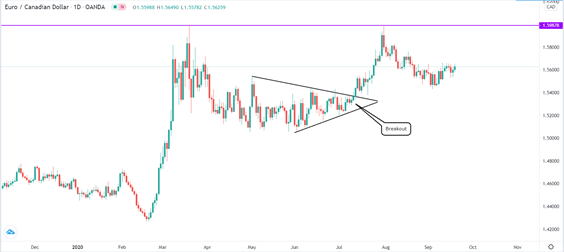
In the chart below, we see that the EUR/CAD pair formed a symmetrical triangle and then broke out higher near the confluence zone. In this case, the pair broke-out higher and moved on to test the previous resistance level at 1.5987.
Symmetrical triangle example
Descending triangle
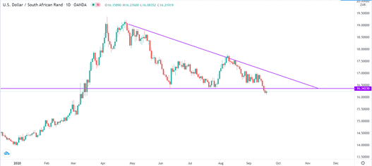
A descending triangle happens when a financial asset is in a sharp downward trend and finds strong resistance. Bulls take over for a while and then the price drops to the same support level. In most cases, the price tends to break out lower. It can repeat the same pattern for some time as shown in the USD/ZAR pair below.
Descending triangle example
Ascending triangle
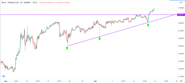
An ascending triangle is the exact opposite of the descending triangle. It happens when the price of an asset is in an initial upward trend, finds strong resistance, and falls back, retests the resistance again, and forms a triangular-shaped pattern. It usually breaks out higher as shown in the EUR/TRY chart below.
Ascending triangle example
Cup and handle pattern
A cup and handle is one of the easiest chart patterns you can identify in the market today. As the name suggests, the pattern resembles a cup with a short handle. The pattern tends to form within a few days, months, or even years. When it forms, the handle part is usually a consolidation that leads to an upper break-out.
A cup and handle usually start when the price of an asset is in a strong upward trend. As it rises, it reaches a point where it finds a strong resistance and then starts falling slowly. In most cases, the price drops until the 50% Fibonacci retracement level and then starts to move up slowly. It then rises and reaches the previous resistance level. At this point, some buyers start to take profit while some bears come back in, pushing the price lower. This is usually the handle part.
Example of a cup and handle pattern
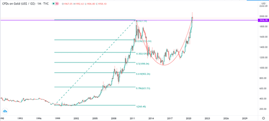
In the chart below, we see that the gold price rose to $1,916 in 2011. Bears moved in and pushed the price to the 50% retracement level. After this, the price moved up slightly and retested the 2011 high. Therefore, the expectation is that the price will decline to the 23.6% retracement level and form the handle section.
Cup and handle example
Head and shoulders pattern
Head and shoulders is one of the most popular and most accurate chart patterns in the financial market. It usually represents a reversal from a bullish to a bearish trend.
The head and shoulders is made up four parts: right shoulder, head, left shoulder, and the neckline.
The pattern starts when an asset in a strong upward trend meets a resistance and starts falling, forming the left shoulder. As it drops, bulls return and push the price above the first top position, the head. In the next step, the bears return and push the price back to the first bottom, the neckline.
Next, bulls start buying the asset, pushing it to the same level as the left shoulder. Finally, in most cases, the price moves below the neckline and continues with a downward trend.
The opposite of this pattern is known as the inverse head and shoulders pattern. It starts when an asset’s price is in a sharp downward trend and forms a pattern that is similar to the head and shoulders pattern. In most cases, the pattern usually moves higher.
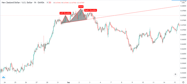
Example of a head and shoulders pattern
Below is an example of a head and shoulders pattern applied in the NZD/USD pair.
Bullish and bearish pennant patterns
A pennant is an easy-to-spot continuation pattern that happens after a strong rally. The pattern happens like a small symmetrical triangle formation.
Basically, when an asset’s price rises sharply, it reaches a point where bulls start to exit as bears start to come in. The sharp upward trend is known as the flagpole.
As this happens the price tends to form a small triangular pattern that is known as a bullish pennant because of its close resemblance to a flag.
The opposite of this is the bearish pennant, which happens after a strong downward trend.
To trade the pennant, traders wait for the convergence point of the two triangle lines. In a previous bullish trend, traders buy the asset at the convergence zone.
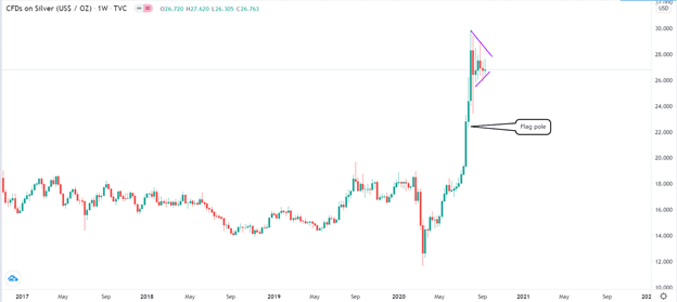
Example of a bullish pennant
The silver chart below shows how the price climbed sharply (flag pole) and then formed a symmetrical triangle (pennant).
Wedge pattern
A wedge is a trend reversal that happens when the strength of a rally starts to wane. It is characterised by parallel but converging support and resistance lines. There are two types of wedge patterns. A rising wedge happens when, after a decline, the price of an asset starts a strong rally. As it rises, the rally starts fading as it approaches the 50% Fibonacci retracement level. As the two parallel and converging support and resistance levels meet, the price tends to fall. A falling wedge is the exact opposite of the rising wedge.
Example of a rising wedge pattern
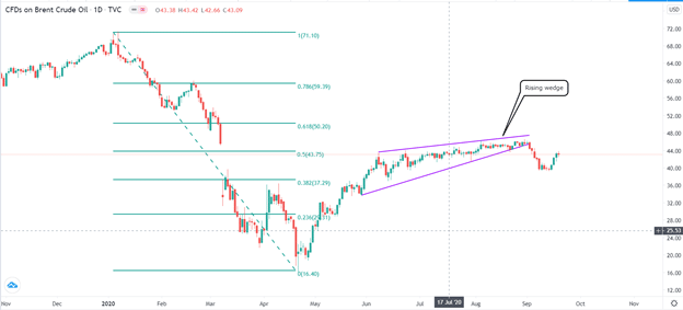
In the chart below, we see that the price of crude oil started a strong upward rally. But as it rose, the rally lost the momentum, leading to a rising wedge pattern.
Final thoughts
Chart patterns play an essential role in trading the financial market. They help simplify trading by mapping a clear path of what to expect. While these five patterns are the most common, the other popular ones are parallel channels, pitchforks, and double and triple bottoms and tops.