What is the Golden Cross?
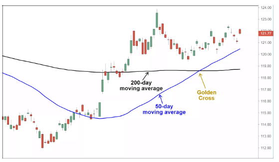
When a short-term MA (moving average) intersects and moves over a long-term MA to the upside, traders and analysts interpret it as a signal for a final upward turn in a market. This is when a golden cross occurs. Until both the averages cross, the short-term MA (moving average) trends up faster than the long-term MA. In other words, a golden cross suggests that there is a long-term bull market. In this case, the long-term average is a significant support level.
A golden cross consists of three main stages:
- The first stage consists of a downtrend that is ending.
- In the second stage, the longer moving average is crossed over by, the shorter moving average.
- The third stage consists of a continuing uptrend. This is expected to lead to higher prices.
What is a Death Cross?
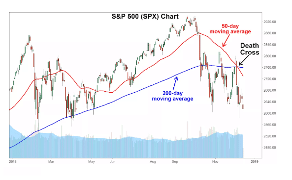
The Death Cross signals a decisive downturn in the market and is like downside moving average crossover. It occurs when the short-term average trends down, crossing the long-term average. In other words, it goes in the opposite direction of a golden cross. It suggests that there is a long-term bear market. In this case, the long-term average is a significant resistance level.
There are many instances throughout history where the death cross has preceded major economic downturns in the world. For example, a death cross was present just before the economic downturns in the years 1929,1938,1974 and 2008, justifying its effectiveness. However, there are other instances where the death cross appeared but turned out to be a false indicator, such as in the summer of 2016.
What is the difference between them?
Both the golden and the death cross occurs when there is a trend change. However, they tend to occur frequently when a change in trend has already taken place. Both of them happen when a short-term moving average exceeds a significant long-term moving average.
However, both these crosses are exact opposites. While a death cross is an indication of a long-term bear market, the golden cross reveals that going forward, a long-term bull market can be expected. After the golden cross occurs, the long-term moving average is a major support level. The opposite is right in the case of a death cross, where the long-term moving average forms the primary resistance level.
Examples and Setups with Pics
In both cases, the most commonly used MAs are the 200-period and 50-period moving average. This period is a representation of a specific time increment, and more considerable periods tend to form more robust constant breakouts.
Example of Golden Cross #1
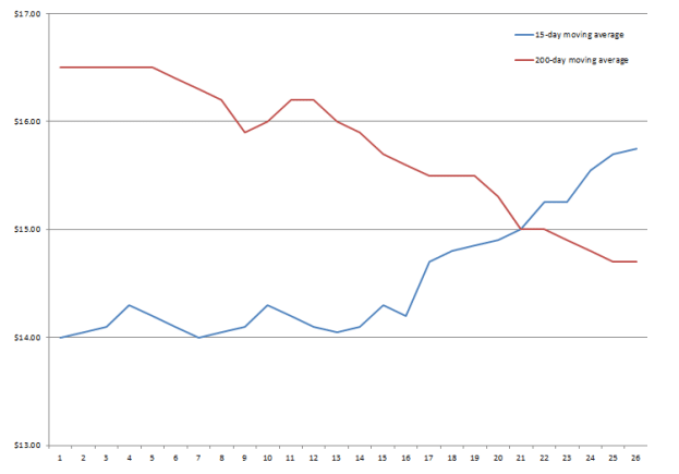
Let’s take a company ABC as an example. In the above chart, ABC’s 15-day moving average is about $14/ share. However, this figure has been rising over the last two weeks. On the other hand, ABC’s 200-day moving average is about $16.50 but is declining. It is still higher than the short-term moving average of $14.
Because the 15-day moving average has been moving upward, it becomes higher than the 200 days moving average at the end of 2 weeks. The golden cross forms at the exact point where the 15 day and 200-day moving average intersect.
Example of Golden Cross #2
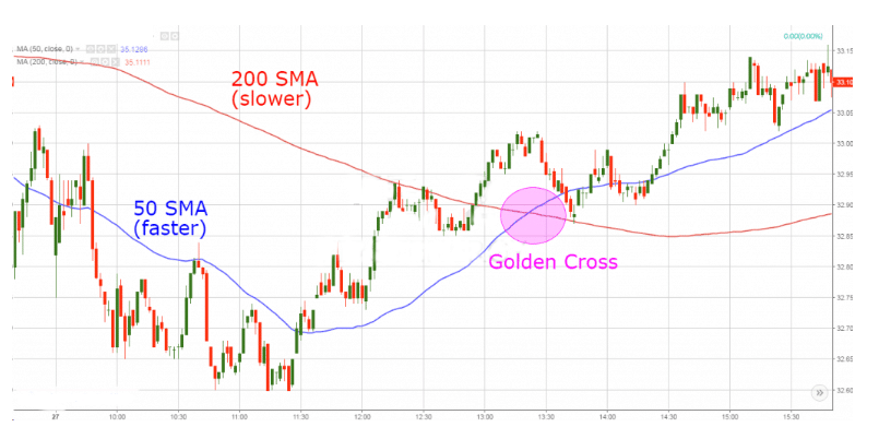
The above chart is a classic example of a golden cross. The red line is the 200-period moving average while the blue line is the 50-period moving average. It suggests a strong downtrend in the beginning. Here the price action stays beneath both the 200 period and 50-period moving averages. The direction of the trend suddenly changes, with the price making a move to the upside. This makes the 50 period moving average react faster to the price change as it is more sensitive to the most recent price action. A golden cross forms when the 50 period moving average crosses the 200-period moving average, highlighted in pink above.
Example of Death Cross
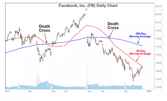
The above example is from FAcebook’s stock in 2018. There are two death crosses here—the first formed in April 2018, after which the stock turned around and entered an extended rally. The second one occurred in September 2018. However, it signaled a bear market for Facebook stocks.
Example of a Death Cross #2
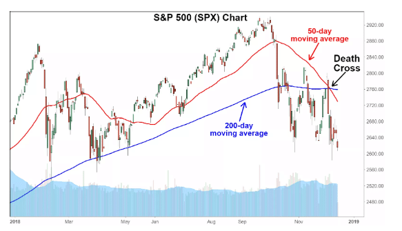
The above is an example of a death cross in the S&P 500, occurring in December 2018. Here, the short term moving average (50 days) crosses over the major long-term moving average (200 days) to the downside. This is interpreted as a final bearish turn in the market.
Conclusion
The golden cross and death cross both help traders indicate market momentum and is extremely helpful. However, technical analysts always have to consider that both of these are lagging indicators. As a result, Traders and analysts should use volume to check the strength of signals. Apart from these crosses, traders may also use the RSI and other additional momentum indicators to get an indication of when an uptrend or downtrend is either oversold or overbought. In either case, the associated breakout is stronger and sustained if the crossover uses longer moving averages. The trader also has to keep in mind that the momentum which the crosses indicate may be temporary. By the time the trader makes use of the information, the market could already change direction.