Coming up with a trading plan is no easy thing, especially for novice traders. However, mastering the various chart patterns that occur regularly can save one the hustle of determining opportunities to pursue or when to enter or close a position.
Chart patterns provide clues on when to trade as they tend to follow well-defined structures for pinpointing low-risk, high-reward opportunities. While one is always sure to be spoilt of choice on trading patterns, some are easy to spot with a bit of practice.
Head and Shoulders
The pattern occurs when momentum in a given direction starts to drop. If the price is moving up, the head and shoulder will appear with price retracing lower followed by a rally that results in a new high. The retracement that follows afterward is often accompanied by price ticking high but not high enough.
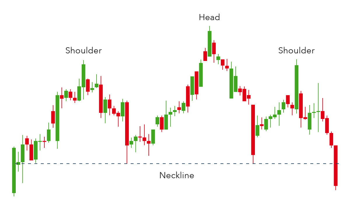
The first and third peaks will always be smaller than the second peak. Once it falls below the neckline, it signals a reversal from an uptrend. Consequently, traders use this opportunity to enter short positions.
The head and shoulder pattern can also occur in a downtrend, thereby providing an opportunity to enter long positions. In this case, the pattern is synonymous with three troughs, with the first and the third being slightly above the second.
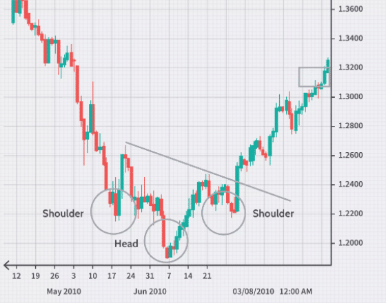
Traders eye long positions as soon as it closes above the neckline, signaling the trend has reversed and that momentum is to the upwards.
Bullish and bearish flags
A bullish flag could come into play after the price has edged higher and hits a crucial resistance level. A pullback that occurs results in a price being restricted in a channel in the shape of a flag.
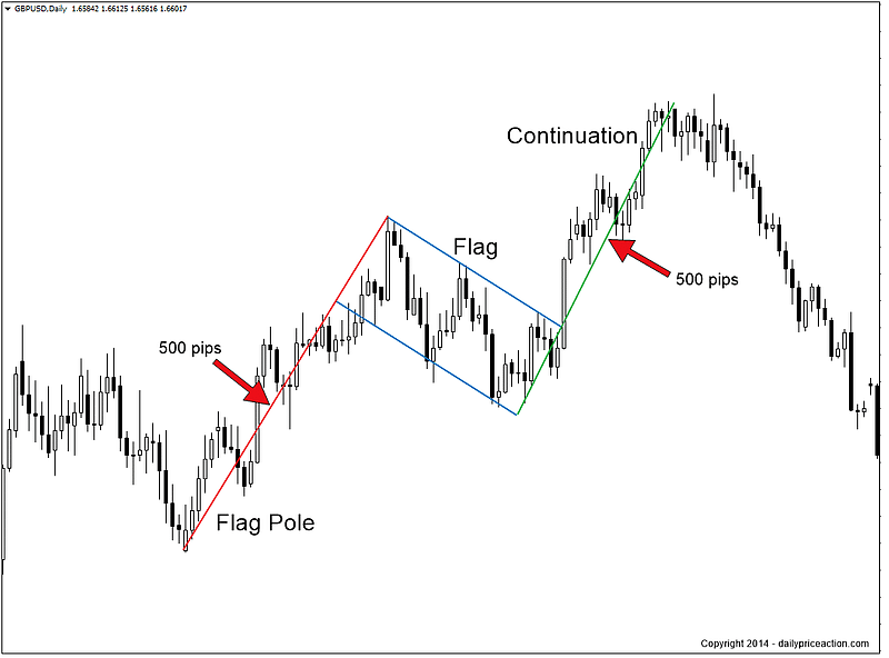
If the lines in the pullback don’t converge, then it is a flag. If they converge, then it is a wedge. Breaking above the upper trend line in the flag only goes to confirm that correction is over, and further upside action should be expected.
A bearish flag pattern occurs when asset prices are tanking whereby bulls come into the picture and try to push up. However, strong resistance from bears results in range-bound trading within a flag setup. Should price breach the lower trend line in the flag, it affirms the continuation of the downtrend.
Triangle pattern
They are characterized by price forming highs and lows and narrowing into tighter and tighter areas. Suppose a triangle appears when the price is trending upwards. In that case, a breakout to the upside should be expected once the upper trend line is breached. Similarly, if it appears in a downtrend, a breakout to the downside should be expected once the lower trend line of the triangle is breached.
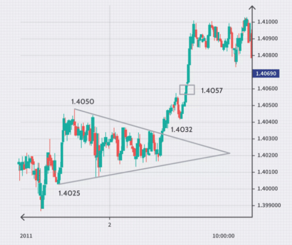
The chart above shows GBPUSD oscillating in a triangle, with the underlying trend being to the upside. The exchange rate can be seen oscillating, forming higher lows and lower highs. As soon as it breaks out of the triangle, it moves up in line with the underlying uptrend. The buy signal can be seen at the 1.4032 level, where GBPUSD broke above the falling trendline.
Engulfing patterns
Engulfing patterns occur whenever momentum in a given direction wanes, signaling potential reversals. If the price was trending lower and a big bull candle emerges, that engulfs the previous bear candle. It might as well signal that bears are losing the fight and that bulls are piling pressure and likely to assume control.
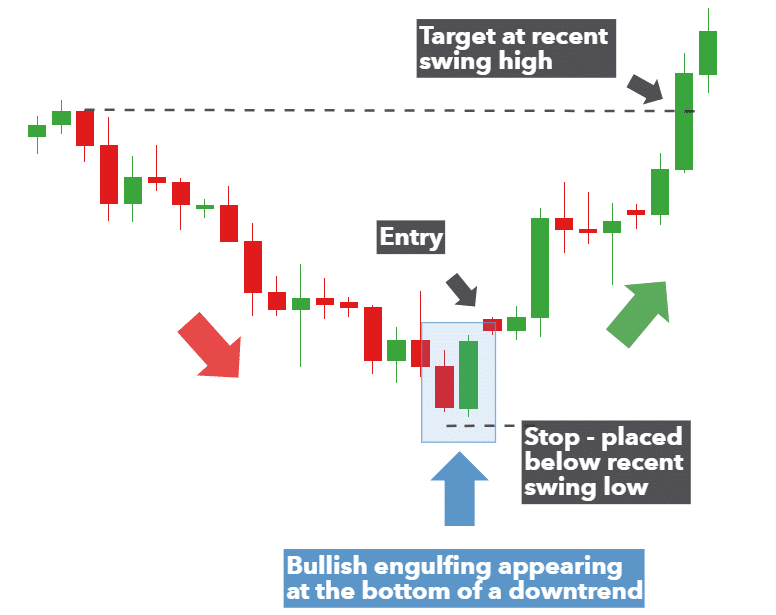
The chart above clearly shows a bullish engulfing candlestick pattern whereby a big green candlestick occurs engulfing the previous bearish candle. Once the green candle closes higher, it signals a momentum shift to the upside.
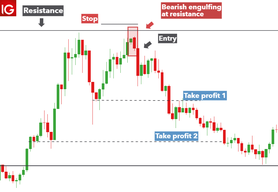
Additionally, if a big bearish candlestick was to occur in an uptrend engulfing a bull candle, it would imply bears are winning the battle.
Double bottom
Double bottom signals potential change in the direction of the trend to the upside. The pattern occurs whenever the price moves lower significantly and hits a crucial support level whereby rejection occurs.
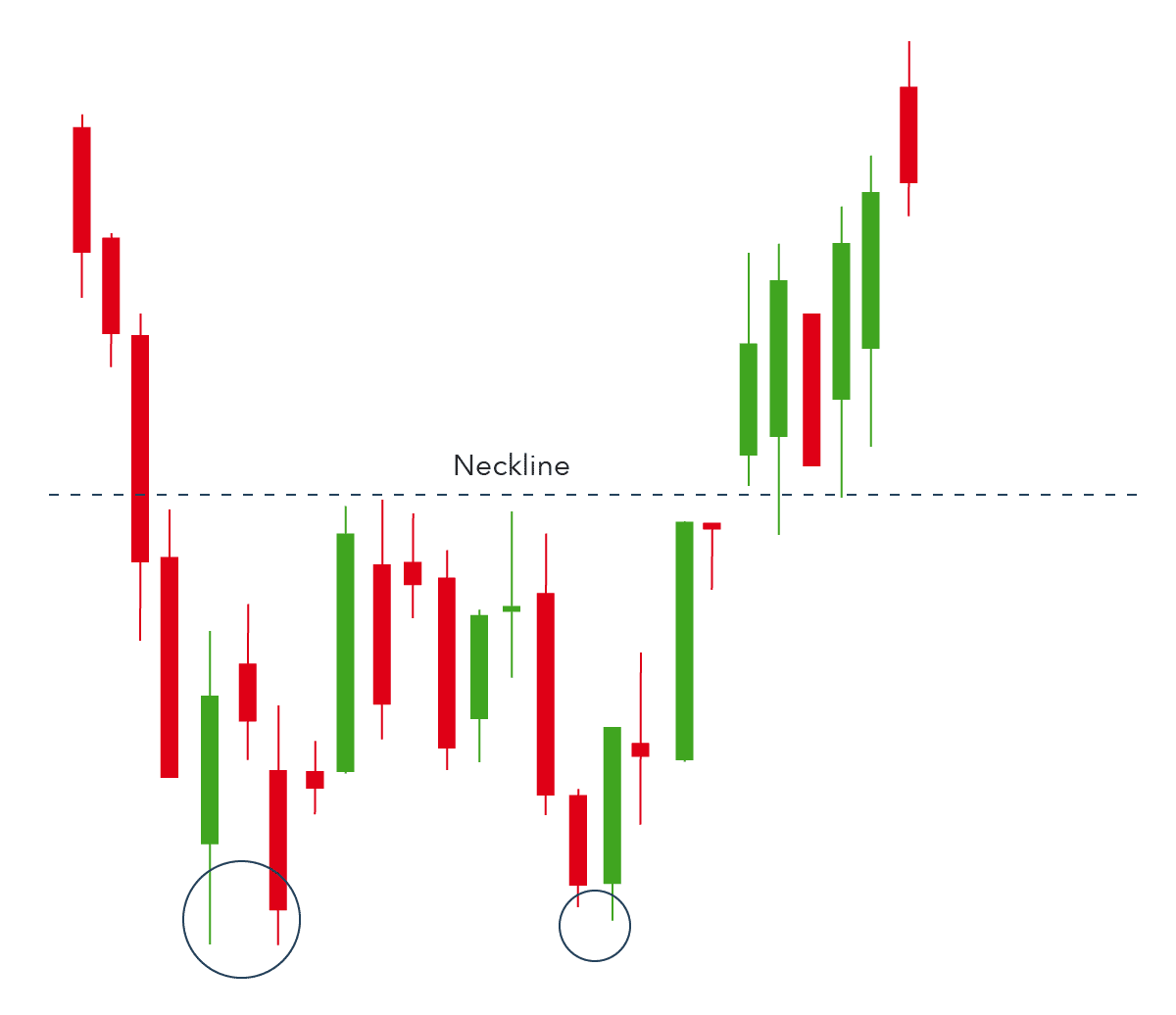
The first bounce back often experiences strong resistance as bears come back into the fold and push price lower back to the previous low. Failure to push the price lower results in the formation of two bottoms, often accompanied by a bounce back. Breaking through the neckline only confirms that a reversal has occurred, which is likely to move up.
Rounding bottom
A rounding bottom signals price is about to break to the upside. It is characterized by lower lows in the first phase. However, the lower lows don’t hold for long, and the price starts trending up, forming higher highs resulting in a round bottom.
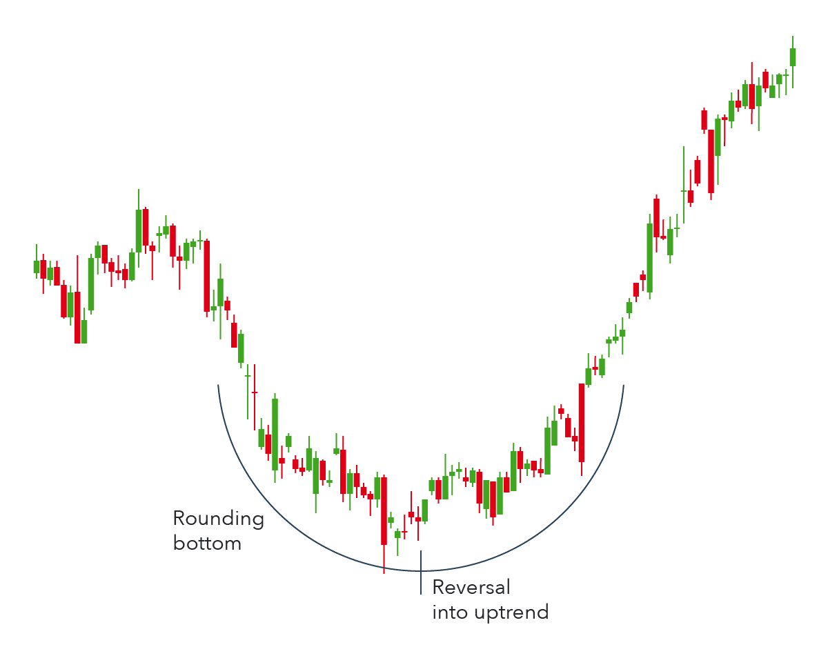
Technical analysts capitalize on this pattern by buying halfway around the bottom just as higher lows form. The bullish reversal is only confirmed on price breaking above a level of resistance.
Rectangle pattern
A rectangle pattern occurs during a period of exhaustion whereby prices oscillate between tight ranges as if to affirm balance. The pattern mostly occurs during periods of consolidations whereby price tends to oscillate between well-defined support and resistance levels.
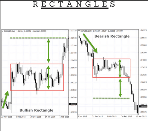
The pattern often signals that price will continue moving in the direction of the underlying trend once the support or resistance levels are breached. In case the price was trending up, and it hits a strong resistance level, consolidation may kick in, resulting in a pullback that bounces off support only to be rejected at the previous high.
Price will continue oscillating between the support and resistance level until buyers overpower the bears and push above the previous high resulting in the uptrend continuation as shown in the chart above.
Similarly, if the overall trend is to the downside, the price will often break the support level and edge lower in line with long term downtrend.
Cup and handle
Just as the name suggests, it is a pattern that appears as a cup with a handle. The first part of the pattern is a round bottom formation whereby price edges lower forming lower lows. A reversal occurs on hitting a resistance level, and bulls assume control resulting in momentum shift to the upside, resulting in higher low formations.
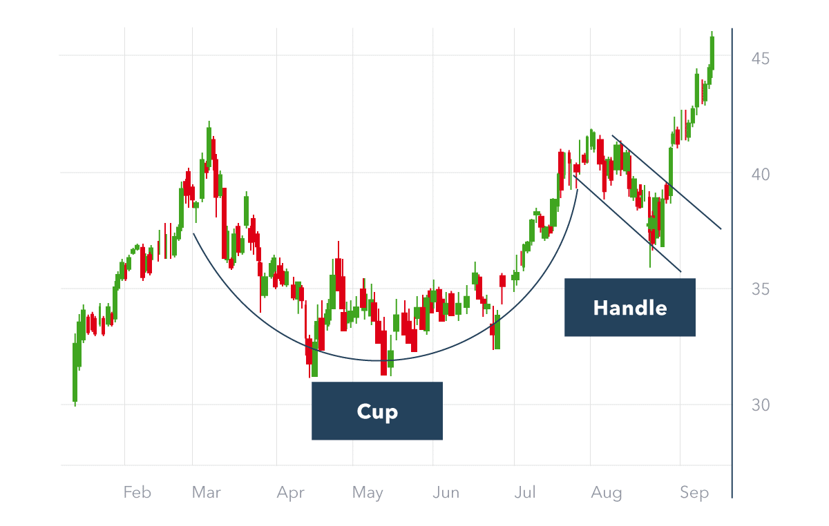
Once the price hits a key resistance level after the round bottom, rejection tends to kick in, and the price starts moving lower, resulting in a wedge formation that often looks like a handle. Breaking out of the wedge only confirms that a reversal has occurred and that more upside action should be expected.
Final words
We looked at some of the most popular and frequently appearing patterns in financial markets. If one aims to profit from them consistently, it’s not enough to only be able to identify them. The true mastery lies in the perfect execution: managing entries, risks, targets, and position sizing. Charts interpretation is also subject to numerous biases and emotional impacts, which is another challenge in profiting from technical patterns.