The foreign exchange market is one of the world’s most active and liquid. It runs around the clock except for a few hours over the weekend. During the busy market hours, traders of all temperaments open and close positions using various styles.
On the one hand, short-term scalpers are looking for fast-moving markets to win a few pips as many times as possible, while, on the other hand, long-term position traders are trying to identify and trade a major trend.
Interestingly, all the traders look at the same currency pairs, but the charts have varying timeframes. For example, scalpers prefer short timeframe currency charts, such as 15 minutes or less, for sufficient volatility. Position traders, on the other hand, would prefer daily, weekly, or even monthly charts.
Explaining the multiple timeframes approach
On different time frame charts, technical indicators, trends, and resistance and support lines do not look the same. For example, you’ll be surprised that a daily chart shows an up-trending market while the same currency pair is falling in a 1-minute chart.
The point here is that analyzing price action over multiple timeframes gives traders a detailed market view. Starting from a 1-minute chart onto daily and weekly charts is similar to zooming out to get the bigger picture.
As mentioned earlier, different calibers of traders often focus on specific timeframes. However, professionals who have been in the market for long enough will tell you that successful traders are biased toward the long-term trend. There are many reasons for the bias, but, primarily, a long-term trend takes a long time to establish itself, and it will take a massive swing to reverse the trajectory.
How to trade with multiple timeframes analysis
A typical multiple timeframe analysis focuses on three charts across three different timeframes. They include a trend, signal, and timing chart.
Trend chart
We mentioned earlier that multiple timeframe analysis measures price action at all levels for better accuracy. A trend chart offers a zoomed-out view of the market, where you get to see the direction of price action over time. Sophisticated traders prefer to call them run charts.
More often than not, single-point measurements could be misleading. A trend chart avoids this by plotting the long-term performance to view the actual performance of the forex pair.
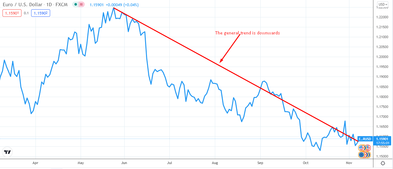
Let’s illustrate the setup of a trend chart for the EURUSD pair. Before we go further, it helps to note that the timeframe of a trend chart varies depending on the timeframes for the other two charts. For instance, you should choose a 1-day trend chart if you typically use a 1-hour chart for signals (signal chart).
In the chart below, the predominant trend in the EURUSD market is downward. It shows that the market has been falling since late May 2021.

In such a case, we should be looking for sell signals in the signal chart.
Signal chart
This is the most critical chart because it tells us what to do. It tells us when to look for the best opportunity to sell the EURUSD pair.
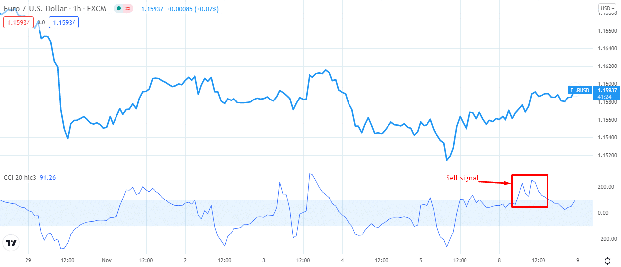
To identify trading signals, you need to use a technical indicator for better directions. Remember, we are only looking for sell signals here because the trend chart showed a downtrend.
The commodity channel index (CCI) is an excellent indicator of oversold or overbought conditions in the market. We will use it on our signal chart to know when to sell the EURUSD.

The 1-hour chart (shown above) indicates the market is ripe for shorting. The CCI index gave a clear sell signal on 1 November, and it appears to be heading into the selling territory soon.
But when exactly should we sell? This is where the timing chart comes in.
Timing chart
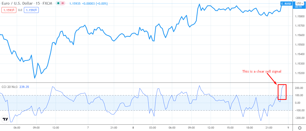
As the name suggests, the timing chart tells you the exact moment you should open or close a trading position. The appropriate timeframe for the chart is often smaller than the signal chart. For example, a 1-hour signal chart should be accompanied by a 15-minute timing chart.

For our illustration, we will use the CCI indicator on the timing chart to determine the specific price point at which we should sell the currency pair. If the indicator’s signal is not clear enough, we narrow the setup with an additional indicator (for confirmation).
High-probability trade setup
A high probability trade setup refers to when you are more likely to make money than lose when you enter the market. In multiple timeframes analysis, the setup involves all the three charts put together.
To identify the high probability trade setup, we first observe the trend chart to determine the dominant trend. This chart is the most zoomed out (with the most considerable time frame, in our case, it is a daily chart). The EURUSD is declining, and it would be unwise of us to try and fight the trend.
Our next stop is the signal chart. The chart helps us find the appropriate sell signal for the forex pair. In our illustration, we used the CCI to generate the sell signal. As you can see, the indicator gave a sell signal on 1 November, and it was in the process of giving off another.
So far, the signal and trend charts line up perfectly. But the timing chart has to tell us when to make a move. Fortunately, the timing chart gives us even more confidence that the appropriate strategy is to sell the EURUSD as soon as possible.
Final thoughts
One is happier as a trader when market analysis generates sufficient confidence in every move that one takes. In our illustration, the multiple timeframes analysis created a high-probability trade setup in which all the charts lined up perfectly.
In short, the multiple timeframes approach helps traders to make better decisions. As the illustration shows, you could make better trades because the analysis will likely give you reliable trading information.