In 2021, it is unfathomable to be a forex trader without the knowledge of indicators. Indicators allow traders to spot underlying trends by examining market data. However, sometimes indicators can be misleading due to external circumstances.
Hence, if you have two indicators that act as a trend-spotter for the same phenomenon, you can cross-reference to verify to see if it is truly a trend or there has been an event that affected one of the indicators. In this article, we will reveal and analyze some of the indicator pairs that best complement each other.
MACD & support and resistance
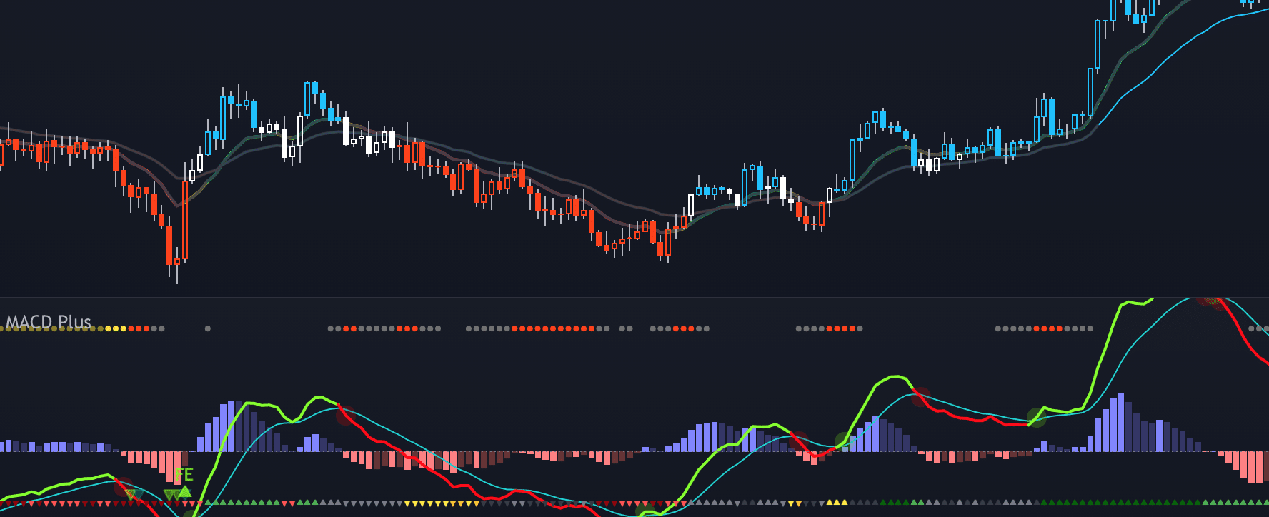
Moving Average Convergence and Divergence, better known as MACD, is an indicator that is not often used on its own. MACD indicates the momentum of a certain trend. It is made up of two EMAs, Exponential Moving Averages – short term and long term one. The most useful information that these histograms provide will be signs of a trend reversal.

The reversal in the trends can be observed when there is one peak in the histogram sandwiched between two bars with lower frequency. The arrow in the photo above indicates a change in market sentiment from bullish to bearish.
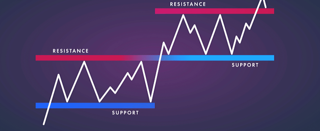
Support and resistance levels are also indicators that could signal a trend reversal. The support level is the ‘lowest’ price level before the value of the asset shoots back up. Support levels can be deduced from analyzing the lowest price level in a given period. On the other hand, the resistance level is the ‘highest’ price level before the value of the asset recovers itself. This is deduced from analyzing the highest price level within a given period.

If the price is at the resistance level and MACD does not indicate that an upward trend is coming soon, there could be huge sell-off pressure as the resistance level is wrongly determined.
The same logic is applied if the MACD shows that there may be a reversal in trend. However, the price has yet to reach the support or resistance level (indicated by the blue or the red zone of the image above), there might be external pressures, or it is not clear where the market will turn. When MACD agrees with the support and resistance levels, traders can be confident that a turn is imminent in the market sentiment.
The drawback of using these two indicators is that it does not account for any external circumstances. The two indicators only show the ebb and flow of the market. You can better your chances of interpreting the market objectively by looking for news that could potentially break the price patterns.
MACD & candle charts
Candle charts represent the opening and closing price of an asset in a period of time. Some candle chart trends have bullish sentiments, while others are bearish. Two of the most famous reversal candle patterns are the evening and morning stars. The former shows a reversal from an uptrend to a downtrend, whereas the latter reverses in the opposite direction.
Much like support and resistance levels, candle patterns ascertain the validity of the MACD histogram. If both indicators point in the same direction, it is likely that there will be a change in the trend of the asset.

One benefit this indicator pair has is that it is user-friendly. By placing one indicator directly on top of the other, you can draw vertical lines down the two graphs at any point in time. You can ascertain a trend if the direction and magnitude of the MACD histogram agrees with the trajectory of the candlestick.
The weaknesses of this indicator pair are similar to MACD with support and resistance levels. Candle charts only offer quantitative data, but understanding what causes these changes is crucial. Is it just the flow of the market, or is there some speculation in the price?
RSI and OBV indicators
The advantage of looking at multiple indicators is having a holistic understanding of the story the market is trying to tell us. Most traders adopt a three-indicator trading strategy consisting of trend-following indicators, momentum indicators, and volume indicators. RSI and OBV indicators represent the second and third category, respectively.
Relative strength index (RSI) measures whether an asset is being overly bought or sold. It is an easy indicator to use, given that most websites automatically generate graphs that represent the RSI of an asset. RSI can act as both a momentum or leading indicator and is popular to users due to its simple concept and user-friendly application.

In the graph above, you can see there are two horizontal lines enclosing a region between 30 and 70. If the buying pattern is within this region, it is considered ‘normal’. However, if it dips below 30, indicated by the arrow on the left, shows that the asset is underbought. Conversely, the arrow on the right shows that the asset is overbought and you can expect a price correction.
The On Balance Volume (OBV) is an indicator that measures the volume of trades. Volume is important because a higher volume represents more market consensus and hence a sign that it is a safer investment. Assets that have low trading volume can be susceptible to having price manipulation by traders with large capital. Because of this, the market has the tendency to have high trade volumes. The periods with the highest OBV could be the best gauge for market conditions and sentiment.

RSI and OBV are usually set up one on top of another. Traders will draw a vertical line between the highest peak in the OBV graph with the corresponding position on the RSI indicator. This will help determine whether the asset is being overbought or sold, which can help traders predict future trends. If it is overbought, you can expect prices to drop. The opposite may happen if it is oversold.
One weakness of this indicator pair is it normally accounts for analyses of one point in time and not through a period. Therefore, it is not particularly helpful in understanding the story behind market changes to make speculative trades. Pairing these two indicators with a candlestick chart or a MACD histogram will give you a more comprehensive understanding of the market.
Closing words
Forex trading has become a data-reliant occupation. To get ahead of your competitors, you have to be proficient in data interpretation. Trade indicators simplify the process of data analysis, but it does not reveal the whole picture.
Use different indicators together to provide the most well-constructed picture of the market at a particular period to make the right decisions about your future trades. Your list of indicators should include one that leads or follows trends, one that reveals momentum, and one that specifies the trading volume.