A market momentum indicator, the Awesome Oscillator (AO), is used to gauge the strength of the market. It uses a 34-period SMA to compare to a 5-period SMA (Simple Moving Average) in order to determine the difference.
There are no limits to the range of this indicator, which is rooted around a zero line and presented as a histogram averaging the results of two SMAs, one of which covers recent momentum and the other covering a lengthier time period in the market.
The midpoints of each bar are used instead of the closing price to compute the SMAs. In most cases, AO is employed to confirm current trends or to foretell when they may reverse.
How it works
The AO is a creation of Bill Williams. It is a simple tool to evaluate market momentum and identify potential trend changes by weighting a 34-period SMA against a 5-period SMA.
Based on comparing two SMAs, price changes are then represented on the histogram according to their respective SMAs.
The market signals bullishness when the 5-SMA exceeds the 34-period SMA, and the obtained histogram is above the zero line. Conversely, we have a bearish market when the value of the histogram is under the zero line, and the 34-SMA is above the 5-SMA.
The color of each histogram bar corresponds to the general market momentum shown by the AO indicator. Bars are colored green if they’re above or below a given day’s average and red if they fall below.
How to use AO in your trading strategy
The zero-line crossing, the twin peaks, and the saucer are three of the most common methods used by traders to find AO chances.
Zero-line crossover
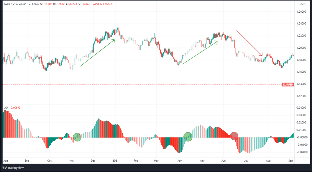
This method is centered on keeping an eye out for when the AO passes the zero line. An indication that the short-term momentum is outpacing the long-term momentum is the crossing of the AO above the zero-line. When that happens, traders take long positions because of imminent price gains.
Suppose the AO crosses the zero line in a downward direction. In that case, traders may be urged into a short position because the indicator shows that short-term momentum is declining faster than long-term momentum.

Aside from that, this method isn’t completely foolproof and should be employed alongside other indicators and fundamentals. On the chart below, the areas in red denote bearishness, while those in green denote bullishness.
The twin peaks
The AO indicator can also be used to detect possible bearish or bullish trading opportunities by looking for twin peaks. When searching for twin peak prospects, below are some common guidelines.
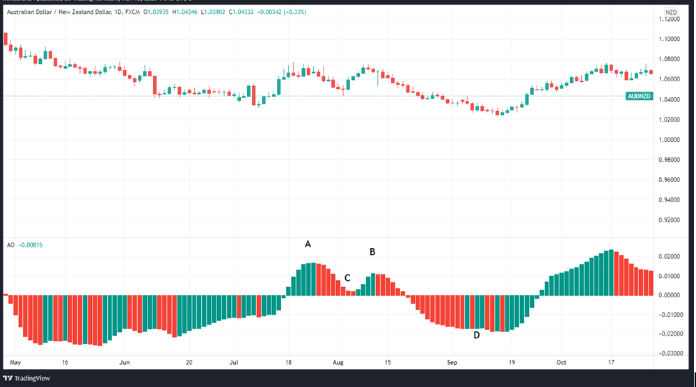
Bullish twin peaks: In a bullish twin peak, there are two successive peaks below zero, but with the second peak higher than the first one and a green bar following. When trading with these peaks, ensure that the troughs separating the two peaks are below zero.
Bearish twin peaks: This refers to the formation of two peaks, with the second one lower than the first one, even though both of them are above zero. A red bar comes after the second peak in this arrangement. To validate the bearishness, the retracement between the two peaks should be above zero.

In the chart above, A shows the first peak, B shows the lower second peak, C shows the trough above the zero line, and D shows the peak below the zero line.
The white lines identify bullish twin peaks, and the second peak is higher, while the bar below zero is green. All the way through the setup, the pullback remains below zero. Following the formation of the bullish twin peaks, the price rises, as evidenced by the location of the blue line below the price bars on the chart.
Two peaks above the zero line are defined as bearish by the red lines, which designate the second peak as being lower than the first, and the histogram that follows the lower peak is therefore red. In addition, the pullback never dips below zero during the whole setup. It’s also worth noting that the price has been declining following the formation of the bearish twin peaks.
Saucer
Three successive phases of movement on either side of the zero line are the primary emphasis of the saucer strategy.
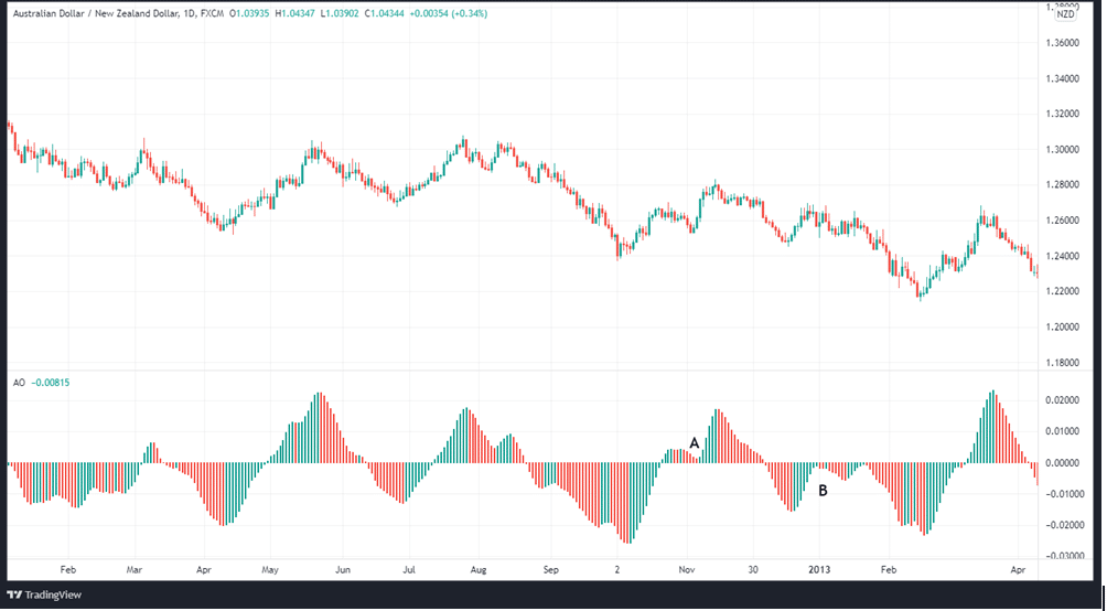
There are three types of saucers: bullish, bearish, and neutral. A bullish saucer is formed when all three histograms are above the zero line. Small saucer-shaped dips appear in the overall histogram as a result of this pattern.
In the event that a bullish saucer is spotted, traders may go long during the third (green) bar or during the fourth bar if it is also green, depending on the market conditions.
In order to form a bearish saucer, two successive green bars must appear below the zero line, the second bar being lower than the first, and then a red bar follows. Traders may sell after the formation of the third red bar or wait for the formation of the fourth one and go short if it is also red.

In the chart above, A shows the bullish saucer while B is the bearish saucer.
Awesome Oscillator: strengths and limitations
Strengths
- A leading indicator since it reflects market momentum.
- The indicator is adaptable and can be utilized for a wide range of asset classes.
Weaknesses
- Due to the wide range of possible false signals, traders should not rely on it as a sole indicator.
In summary
The Awesome oscillator is effective in signaling the validity of market trends whether in manual or automated trading. It is used to confirm or reject market trends based on an assessment of short and long-term SMAs. In order to confirm or predict market reversals, AO is used to gauge market momentum and confirm trends. In order to do so, it compares the current market momentum to the overall market momentum over a longer period of time.
You can now implement the Awesome oscillator in your trading strategy or your MT4 and MT5 expert advisor.